6 Sales Page Examples (With Helpful Free Training!)
If you sell a service or a product (or anything really) as a part of your online business, there is a good chance you’ll need to write a sales page –preferably a high-converting sales page. Why? Because sales pages are game changers for landing sales and oh-so-important for your business growth!
But have you ever sat down to write a sales page? Trying to DIY your own sales page can certainly feel daunting, but when you learn how to write persuasive copy that helps your reader take action right away, you can grow your business with EASE.
You’ll definitely have a leg up knowing the ins and outs of writing a high-converting sales page! Luckily for you, our lead copywriter and owner of the BDCC, Becca has a long track record of writing amazing conversion copy for clients.
And to help you hone the craft with tangible examples, we want to examine 6 Sales Page Examples and explain exactly why we love them and what sets them apart from other sales pages out there.
But first, in case you need a quick recap, we want to briefly define what a sales page is.
What exactly is a sales page?
A sales page is an individual, stand-alone web page on your site that sells a specific product or service you are offering to your audience. A sales page is there to connect with your potential client, address any questions they might have surrounding your offer, and remove any doubts or objections that come up around your offer. There are important differences between a sales page, opt-in page, and landing page.
When done effectively, a sales page easily guides visitors toward making a purchase –aka investing in your mouth-watering offer.
6 Sale Page Examples From Our Clients
Whether you’re selling a masterclass, online course, a suite of programs, a membership, or anything else, having a high-converting sales page is key to making those sales and transforming your customers’ lives (or businesses!). The key is conveying how through all elements of your copy, through design, and especially through social proof or testimonials.
To help you see how an effective sales page works, let’s see a live sales page in action! Below are some of our favorite examples of sales pages that we’ve done over the years for our clients, including what makes them work, specific copy elements that directly effect the audience actions and more.
-
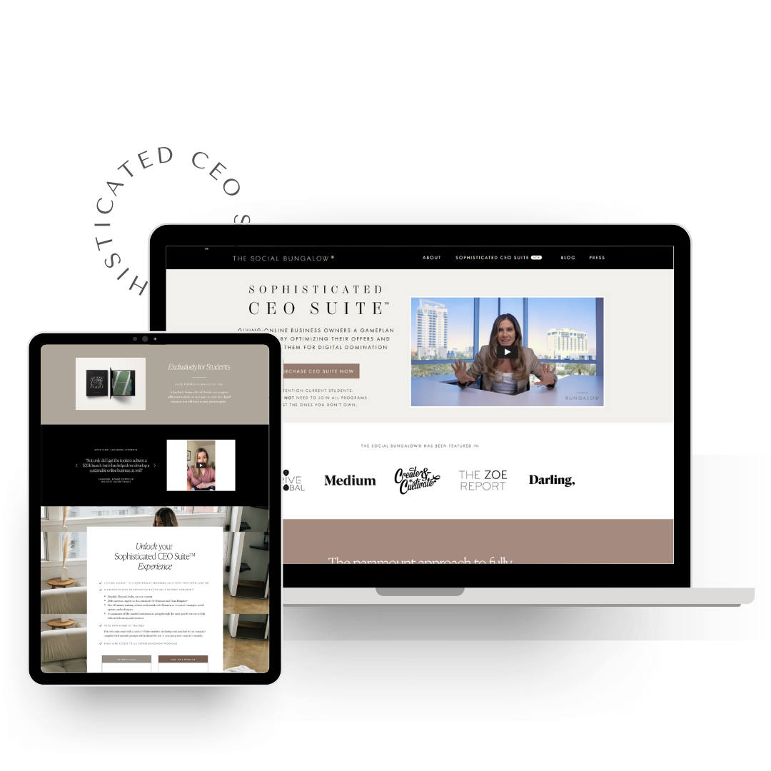
The Sophisticated CEO | The Social Bungalow
The Sophisticated CEO from Shannon Matson of The Social Bungalow is a suite of programs designed to give business owners a game plan for making profits by optimizing their offers and marketing them for digital domination.
We chose this example because the page is bold, sophisticated, and direct in its copy and speaks to a very specific level of business owner (target audience).
Why this sales page example works
-
The sales page boldly starts with a video of Shannon talking all about her suite of programs and how it’s going to transform a buyers business
-
Distinctive headlines and descriptions speak in the audience’s language, making the content more relatable
-
The consistent color scheme with pops of color draws attention to key information –especially the CTAs
-
Thorough explanation of what buyers receive inside the program and how it will help them
-
Videos, screenshots, and written testimonials improve trust in the program suite via real-life experiences.
-
The Call to Action includes a clear visual design element, which makes people pause to take action.
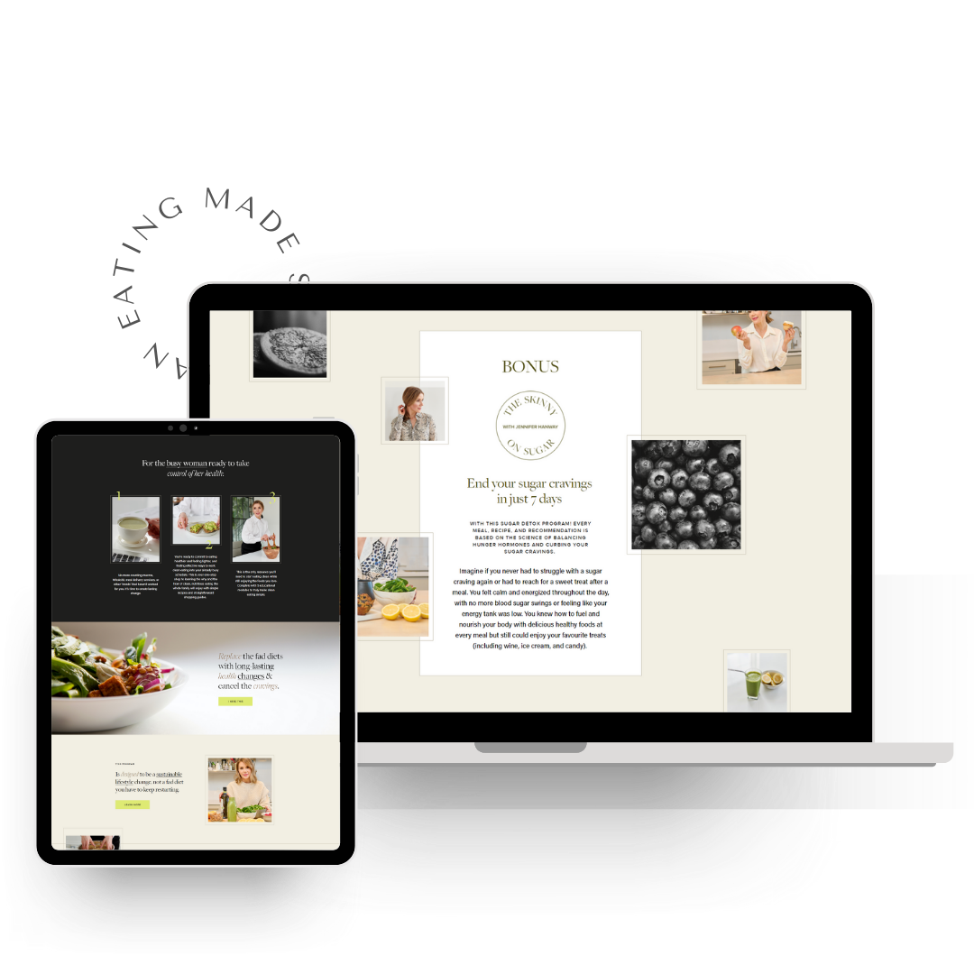
2. Lean & Clean | Jennifer Hanaway
Lean & Clean from Jennifer Hanaway is an 8-week online course for women who want to achieve sustainable weight loss and find consistency with their diet and exercise routine.
We chose this example because the page is straightforward, speaks to the reader’s pain points, and provides a thorough rundown of what’s included, what to expect, and why this program is going to change lives.
Why this sales page example works
-
Bullet points address the reader’s fears and sympathises with their struggles
-
The Call to Actions includes a clear visual design and color element, along with personalization allowing for more chances to convert readers
-
The copy is clear, to the point, and conveys how this course will help women lose weight sustainably
-
The consistent color scheme with pops of color draws attention to key information
-
A navigation bar/jump-to links help readers find the exact information they’re looking for on the page
-
Videos, screenshots and written testimonials improve trust in the program via real-life experiences.
-
Includes a very robust FAQ section that helps to answer any questions
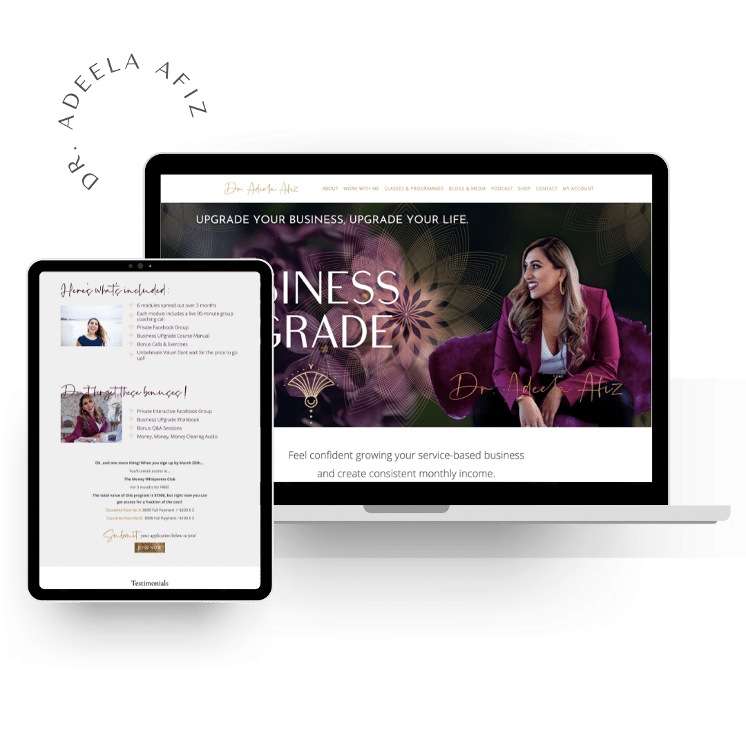
3. Business UPgrade Programme | Dr. Adeela Afiz
The Business UPgrade Programme from Dr. Adeela Afiz is a programme designed to give you the strategy, plan, and knowledge to know what to implement in your business to create consistency so you can create a life and business you love.
We chose this example because the page is passionate, revolutionary and focuses on unlocking clients’ consciousness and building a strong business through mindset shifts, aligned practices, and energetic reprogramming.
Why this sales page example works
-
Bullet lists show the benefits to readers in a way that’s easy to skim through and highlight important information throughout the sales page
-
The use of images and subheadings breaks up the sales page copy, making it easy for users to digest
-
Written testimonials to improve trust in the programme via real-life experiences
-
Multiple CTA buttons offer plenty of chances for users to convert
-
The consistent color scheme with pops of color draws attention to key information –especially the CTAs
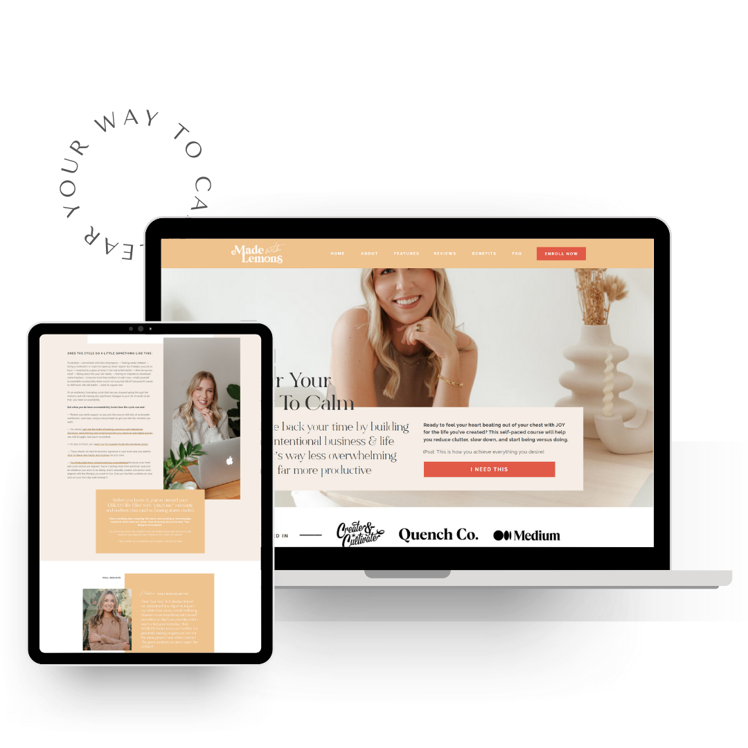
4. Clear Your Way To Calm | Livia Boerger
Clear Your Way To Calm from Livia Boerger is a self-paced course that helps business owners take back their time by building an intentional business so they can be less overwhelmed and more productive.
We chose this example because the page is clean, straightforward, and down-to-earth with detailed and impactful copy that gets straight to the point but also conveys how this course will improve the reader’s life and business.
Why this sales page example works
-
A chatbox is available with a personalized video that welcomes readers and invites them to ask any questions they might have about the course
-
The “Who Should” and “Who Should Not” enroll sections further emphasizes why people should give it a try
-
Personalized CTAs that pop with color and convince readers that this course is for them
-
Bullet lists, bolding, italicization, and alternative fonts highlight key messages and show the benefits to readers in a way that’s easy to skim through
-
A “Let’s Chat” section that goes through busts through each mental block that might keep the reader from investing in this course
-
Thorough explanation of what buyers receive inside the program and how it will help them achieve their goals
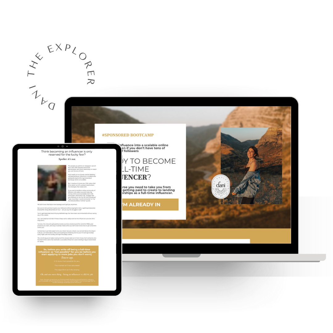
5. Sponsored Bootcamp | Dani Rodriguez
Sponsored Bootcamp from Dani Rodriguez of Dani The Explorer Brand is the ultimate Instagram influencer and content creator course for aspiring creators who want to get paid brand deals, grow an engaged community, and build a recognizable brand.
We chose this example because the page is simple and to the point with detailed and impactful copy that conveys how this course will improve the personal brand or influencer business.
Why this sales page example works
-
The headline and subheading immediately explain how the course can help users and what they’ll get out of it
-
Multiple CTA buttons offer plenty of chances for users to convert
-
Video, screenshots, and written testimonials improve trust in this course via real-life results from students and boost credibility
-
The copy speakers directly to the target audience in their voice, making is relatable to ideal customers
-
Robust FAQ section to answer any questions from potential customers
6. Weddings 101 | Rebecca Yale
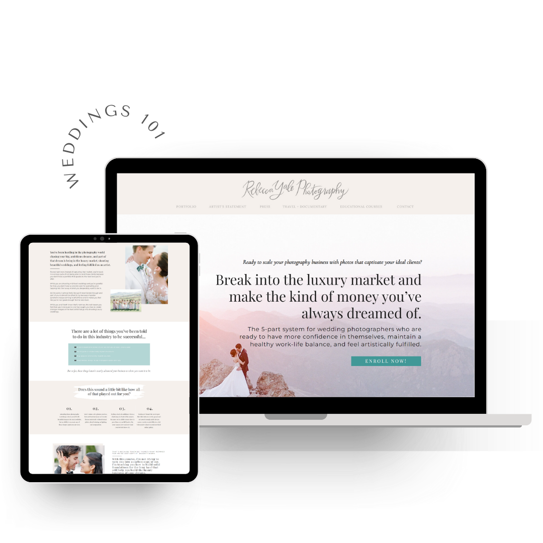
Weddings 101 from Rebecca Yale is a 5-part system designed for wedding photographers who want to break into the luxury market and make more money so they can achieve a more sustainable work-life balance.
We chose this example because the page is timeless, thoughtful, and really focuses on the emotion and pain points of the reader.
Why this sales page example works
-
Almost all of the page copy addresses the problems visitors face, empathizing with the reader and where they’re at in their career
-
A thorough rundown of the features and modules included in the course + an informative video walkthrough of each module
-
It includes a 100% money-back guarantee that can remove the hesitation users may have about buying the course
-
Case studies detail how people who have taken the course have transformed their lives, increasing trust.
-
Plenty of detailed success stories and video testimonials to boost credibility.
-
The clear FAQ section answers any lingering questions from potential customers.
-
Personalized CTA copy encourages users to click
3 Critical Elements Every High-Converting Sales Page Should Have
All of these sales page examples contain the essential elements that every high-converting sales page should have. But instead of highlighting ALL elements (we’ll save that for a future post), we want to quickly highlight the three critical elements that can make or break your sales page!
-
A catchy headline
We don’t know how else to say this, but headlines are so important for your sales page. Make sure you have a catchy headline that captures their attention, gives them context, and evokes emotion – all in one go.
Ultimately, you want people to FEEL something when they land on your page and read that headline. Because when they feel something, they get hooked. And if you don’t hook your reader right away, they probably aren’t going to stick around and continue reading down the page.
When you write your headline, think about what transformation people will get when they join your program/course.
-
What is the bold promise?
-
What will people get when they implement your offer?
-
What does life look like?
This transformation should always be at the front of your mind as you write your headline.
2. Sell the transformation, not the product
Always always always talk about the benefits or transformation your reader will experience after working with you. How does my offer positively change my clients’ lives?
Everything you write needs to be with your client’s benefit in mind.
People don’t care about how many templates are included, they care about how those templates will make writing their launch emails so much easier.
What sounds more appealing?
-
“12 email launch templates” OR
-
“Get back HOURS of time with 12 plug n’ play email launch templates filled with copy that is ready to go! All you have to do is plug in your biz information and hit that send button!”
Do you see how you’re selling time and easy rather than templates?
3. A strong call-to-action
Call-to-actions or CTAs are huge elements that deserve attention. Why? Because your CTA is the gateway for your visitor to transition through to a paying client –and that’s the whole purpose of a sales page!
But the catch is to make sure your CTA tells your reader exactly what to do. A CTA is your last shot at converting readers into customers. So don’t skimp on this! Make it clear, direct, and convincing.
At the end of the day, a sales page is meant to convert visitors into paying clients. Hopefully, these sales page examples will help you get inspired and apply the tips and strategies to your own sales page (or your clients!).
Luckily for you, here at BDCC, we love us some sales pages! So much so that have two in-depth blog posts, a FREE training (which we’ll mention at the end), and tons of resources in our BDCC template shop.
Ready to learn even more about writing sales pages? We have a FREE 30 minute training that will walk you through section-by-section how to write a sales page that builds connection and sells for you.
Inside the BDCC ship, we also have tons of digital products catered to writing a sales page including our favorite, the Plug n Play Sales Page Template + Sales Page Prompts + Outline, a completely comprehensive sales page guide will teach you exactly what to include in a high-converting sales page. This 39-page packed guide is complete with 17-sections that each layout a specific section of the sales page.
If you want to uplevel your copywriting game in other areas outside of sales pages, check out our blog on the 10 Top Copywriting Tips for Beginners (With Examples) or just check out the blog in general! We have TONS of copywriting resources and how-to’s to help you write with ease and skill!