Website Copywriting for Service-Based Businesses
You don’t need to keep struggling with what to say (or prompting AI a hundred times for mediocre results)
I write website copy, sales pages, and email marketing for service-based businesses.

People buy from people + brands they can relate to and connect with
Your unique messaging is how you do that.
I’ve written websites, sales pages, and emails for over 350 service-based businesses that resonate with their target audience and makes them say: “I’m obsessed with my new copy and my clients are too!!!” just like Anna did.


If you:

Keep rewriting your web copy but can’t get it to sound “right”
Have lots of talking points but no clue how to structure them

Simply hate everything about DIY-ing your website/sales page/emails

Hand your copy over
(seriously, gimme)

With my website copywriting packages, I'll take your jumbled thoughts, half-finished drafts, and “I don’t know what to say” stressors and make you say: “Oh my gosh, I'm so amazed by how you turned my brain dump blabbering into THIS!!! I'm so so so happy and excited!”
Thanks, Emily!
LET YOUR WORDS RAVE ABOUT YOU / LET YOUR WORDS RAVE ABOUT YOU / LET YOUR WORDS RAVE ABOUT YOU
LET YOUR WORDS RAVE ABOUT YOU / LET YOUR WORDS RAVE ABOUT YOU / LET YOUR WORDS RAVE ABOUT YOU
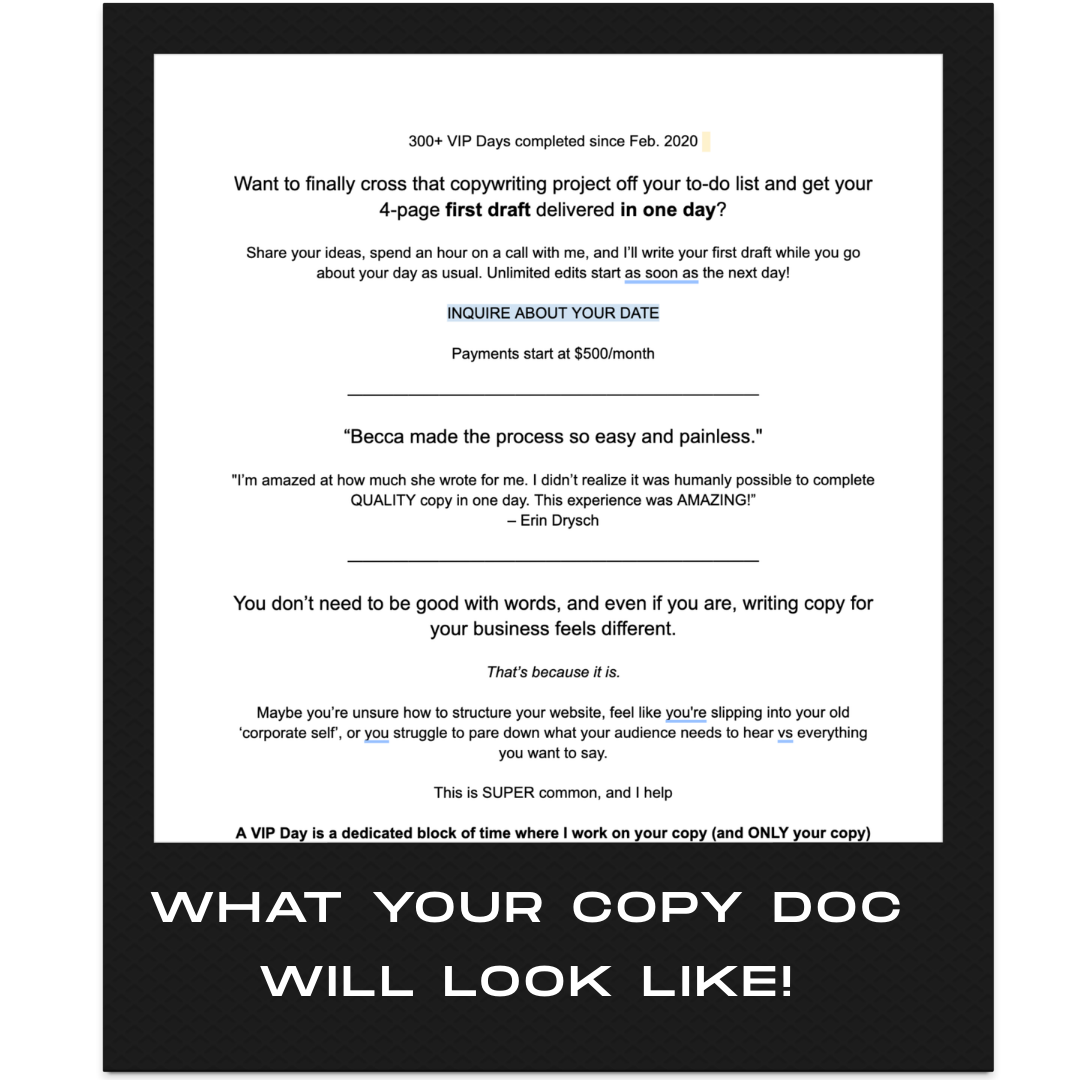
Meet the copywriting offer that’s been booked + loved over 300 times since February 2020

The signature client favorite: VIP Day


Aka your first draft in a day & most clients starting point to working together.
Give me one day, and I’ll write the first draft of your website copy (or a sales page!) from scratch.

hey I’m Becca


Real connection doesn't happen by accident, and it definitely doesn't come from a chatbot.
Vague, safe, personality-free copy is the fastest way to blend in + get ignored. AI has flooded the internet with more of exactly that.
The same way your brain learned to skip banner ads without even registering them, audiences are now pattern-matching AI copy and mentally checking out before they even finish the first sentence.
Lacking specificity and personality is the number one area where businesses go wrong. I could tell you, “I write copy that converts” all day (boring), but why say that when we can go deeper…
I WRITE COPY THAT MAKES YOU FEEL LIKE YOU’RE HAVING AN OUT-OF-BODY EXPERIENCE WHEN YOU READ IT, THAT MAKES YOU FEEL LIKE I KNOW YOUR BUSINESS BETTER THAN YOU DO.
(I don’t, but it’s pretty damn cool when clients say that to me… thanks Tasha + Adrienne!)
Point blank, I’m a people-person, I live for connections, I’m nosy inquisitive (without being intrusive), and I want you to have copy you’re proud to show off.


Projects that’ve made my clients get chills reading through their copy


BECCA I’M SO OBSESSED I COULD CRY!!!!!!!! I’m not finished reading through it but I literally got chills when I was reading through it this morning.

Quit censoring yourself.

My best advice for you when it comes to your business:

Or let me say it for you!
UNLESS IT’S HATEFUL, RACIST, HOMOPHOBIC, ANTI-CHOICE, THEN SEE YOURSELF OUT
People don’t connect with rigid, boring, and overly polished — they connect with realness, personality, and fun (especially in the age of AI. Which, btw, I promise my own fingers typed that “dash” 😉).

